Color Scheme
All colors are compliant with WCAG 2.1 and ADA standards.
Primary Colors
Color is the cornerstone of Rocky Mountain ADA design. It distinguishes our brand and helps us to create consistent experiences across marketing and products. We use color in meaningful ways in all expressions of our brand. We use color to pinpoint exactly what people need to see.
We are committed to complying with AA standard contrast ratios. To do this, we choose primary, secondary and extended colors that support usability. This ensures sufficient color contrast between elements so that users with low vision can see and use our products.
TODO: CREATE VUE COMPONENT FOR COLOR CARD
b100 - Rockies
| HEX | #1b43ad |
| RGB | rgb(27, 67, 173) |
| HSL | hsl(223.56, 73%, 39.22%) |
| Oklch | oklch(42.74% 0.18 264.29) |
| CSS | var(--b100) |
| Pantone | 2728c |
n0 - Snow
| HEX | #ffffff |
| RGB | rgb(255, 255, 255) |
| HSL | hsl(0, 0%, 100%) |
| Oklch | oklch(100% 0 0) |
| CSS | var(--n0) |
| Pantone | Trans.Wt. |
n400 - Slate
| HEX | #1d2c47 |
| RGB | rgb(29, 44, 71) |
| HSL | hsl(218.57, 42%, 19.61%) |
| Oklch | oklch(29.4% 0.05 261.53) |
| CSS | var(--n400) |
| Pantone | 533c |
n20 - Sugar
| HEX | #ebedf0 |
| RGB | rgb(235, 237, 240) |
| HSL | hsl(216, 14.29%, 93.14%) |
| Oklch | oklch(94.54% 0 258.32) |
| CSS | var(--n20) |
| Pantone | 427c |
Secondary Colors
Our secondary palette contains a variety of colors to keep things fresh and interesting. We lean on these colors more frequently when brand awareness is high, or on our own properties where we control the surrounding environment. Try to use the primary palette when applicable.
When these colors are used in conjunction with our primary palette, these colors makes every moment feel on-brand.
t100 - Bob Ross
| HEX | #05aac7 |
| RGB | rgb(5, 170, 199) |
| HSL | hsl(188.97, 95.1%, 40%) |
| Oklch | oklch(68% 0.12 215.77) |
| CSS | var(--t100) |
y100 - Butterscotch
| HEX | #ffab00 |
| RGB | rgb(255, 171, 0) |
| HSL | hsl(40.24, 100%, 50%) |
| Oklch | oklch(80.34% 0.17 73.79) |
| CSS | var(--y100) |
r100 - Cinnabar
| HEX | #e84f2d |
| RGB | rgb(232, 79, 45) |
| HSL | hsl(10.91, 80.26%, 54.31%) |
| Oklch | oklch(63.41% 0.2 33.96) |
| CSS | var(--r100) |
g100 - Mojito
| HEX | #31a579 |
| RGB | rgb(49, 165, 121) |
| HSL | hsl(157.24, 54.21%, 41.96%) |
| Oklch | oklch(64.65% 0.12 163.43) |
| CSS | var(--g100) |
p100 - Prince
| HEX | #5d50ad |
| RGB | rgb(93, 80, 173) |
| HSL | hsl(248.39, 36.76%, 49.61%) |
| Oklch | oklch(49.24% 0.14 286.29) |
| CSS | var(--p100) |
Adobe Color Scheme file
If you use any Adobe products, you will be able to import the .ase file to import the entire color palette into Photoshop, Illustrator, etc.
Notes for Color Blindness
For people with color-blindness, Avoid using the Purples if you need to distinguish information by color, for example a color coded bus-route map.
To distinguish information by color, it is best to use texture or patterns as well. For example:
- Solid red line
- Short dashed blue line
- Triangle dashed purple line
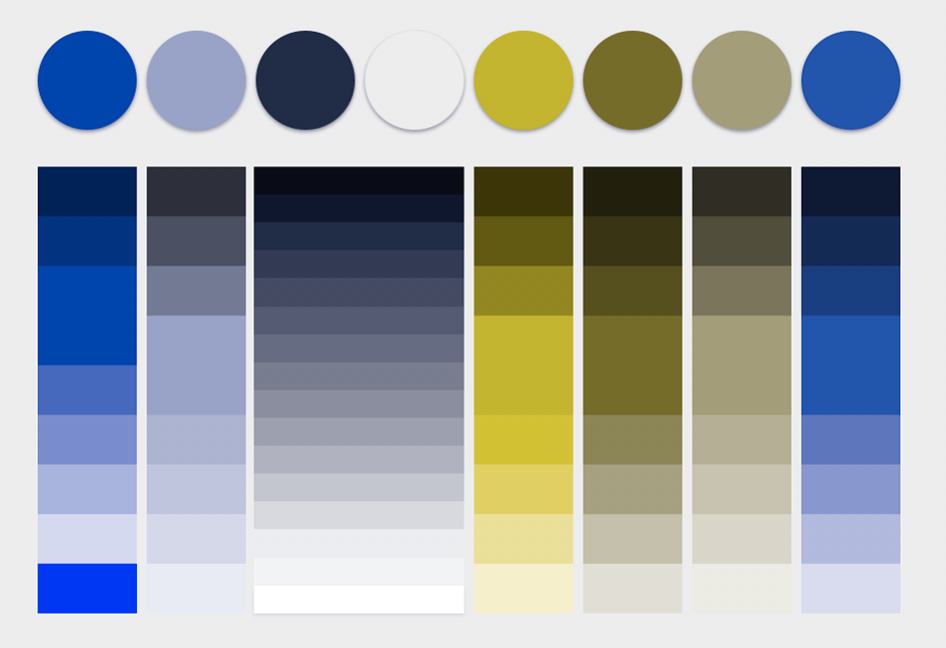
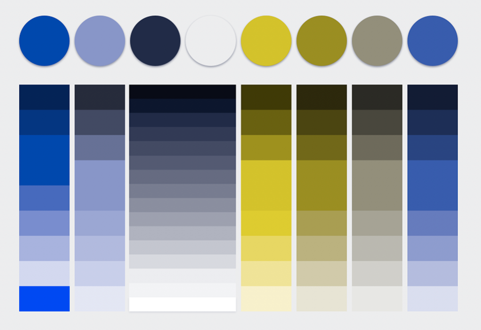
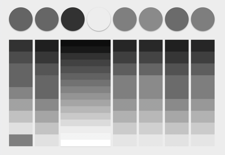
Purples tend to blend in with the blues in this color scheme. See images below:
Hover over the images to see the full-vision color scheme


