![]()
Our logo is one of the most essential and omnipresent elements of our identity – a universal signature across all Rocky Mountain ADA communications. While it is a simple logo, we must treat it with care. This page covers the correct usage.
Logo Description
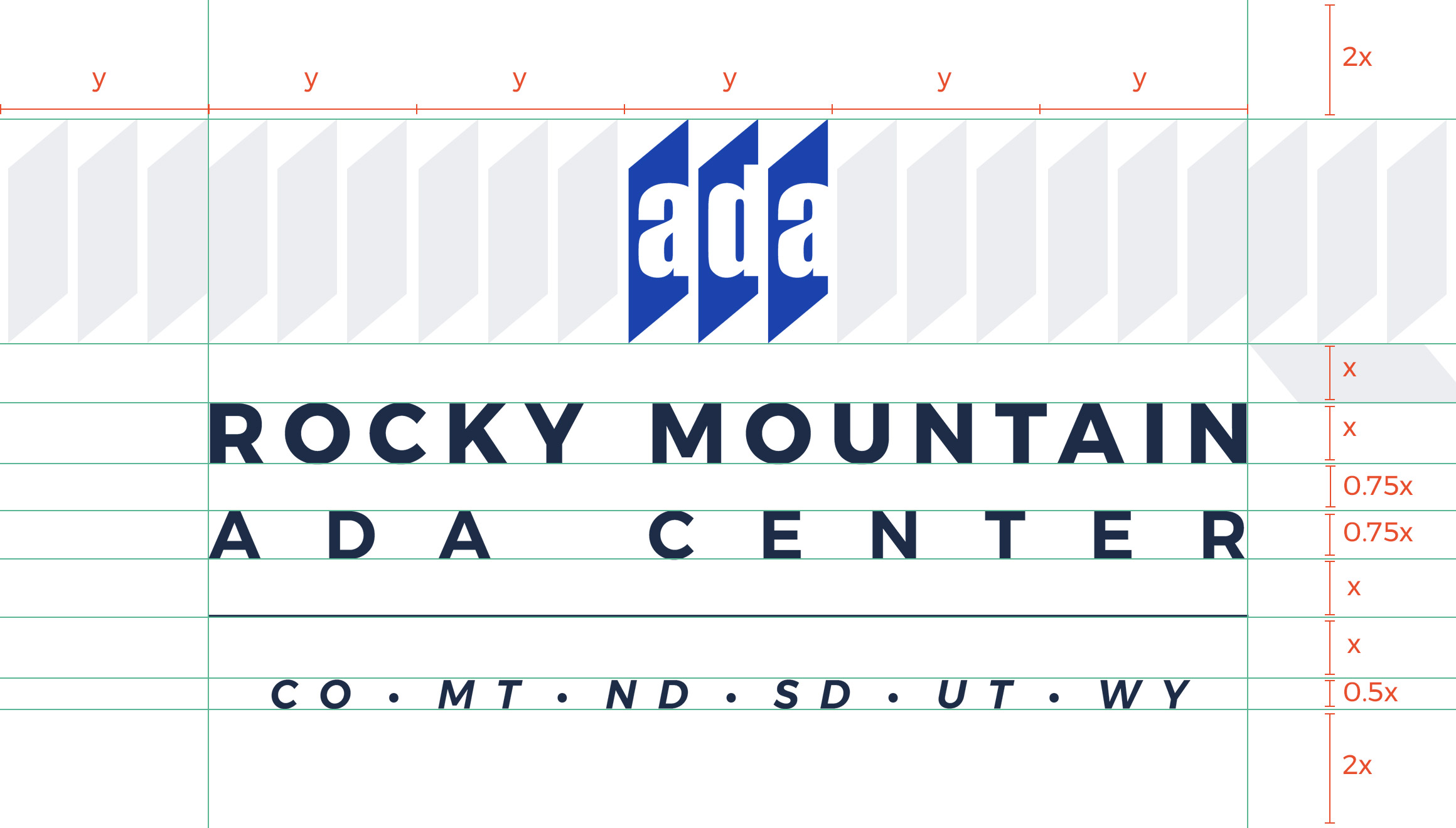
The logo is simplified to show the ADA logo and a type treatment of the ADA Center's name.
![]()
Rationale
The new brandmark represents the simplicity of the Rocky Mountain ADA. It combines the official ADA logo with a clean and open type treatment, using the Montserrat font.
The state abbreviations are optional, but serve to reinforce the region the Rocky Mountain ADA serves. Use whenever possible.
The mountain icon has been removed from the old logo. This caused confusion among states that do not typically identify as mountainous.
![]()
Spacing
The clear space around the logo on all sides should be equal to the width of the ADA mark for maximum legibility and impact. Where clear space is not at a premium, (e.g. application headers), the clear space rule does not apply.
Favicon
On the official company website and other company related websites, a positive brandmark appears in the browser address bar. The proportions of the favicon are optimized for small size and different from its larger sibling to ensure better legibility and visual presence.